Mobile at population scale, in the public sector.
I led design direction for the mobile team's work on São Paulo's Now Mobile rollout — the first major public-sector mobile account on the ServiceNow platform, targeting 1.1 million state employees. The team's central design call was a pre-login state that let citizens and employees discover services before identifying themselves. Ninety-five thousand users adopted the app in four days. One hundred and fifty thousand within two weeks. The launch ranked #1–#2 in mobile usage across the platform that month — and confirmed mobile-first as a primary channel for government services at population scale.
The bet
Most enterprise mobile apps inherit a working assumption: the user already has credentials, the user already knows the app exists, and the user is opening it because someone told them to. None of those assumptions hold for a public-sector mobile app aimed at population scale.
A state employee opening a government services app for the first time isn't pre-onboarded the way a SaaS knowledge worker is. They may not know what the app does. They may not know whether their use case is supported. They may not be sure their credentials work, or whether they have credentials at all. If the first thing they see is a login wall, a meaningful share of them will close the app and never return.
The bet the mobile team made for São Paulo was that the design of the logged-out state — the experience before authentication — was the experience that would determine whether the launch succeeded. Get that right and the rest of the app could carry adoption forward. Get it wrong and 1.1 million addressable users would mostly never see the second screen.
The before state
ServiceNow's mobile platform — Now Mobile — had matured on the assumption that the user is an authenticated enterprise employee opening the app to perform a known task. The login screen was the first screen. The experience was tuned for efficiency once inside, not for discovery before logging in.
That assumption was correct for the majority of accounts the mobile platform served. Internal employee experiences, IT service portals, field-service workflows — all of them benefited from getting the user inside the app and to their work as fast as possible. There was no reason to redesign the front door for a problem the platform didn't have.
The São Paulo account changed the problem. The customer needed to reach 1.1 million state employees, many of whom would be opening the app for the first time, on personal devices, without the warm onboarding context that an internal corporate rollout provides. The customer also wanted the app to be a credible public service — meaning it should look like something a state government would publish, not a generic enterprise utility behind a login wall.
Three structural facts shaped the team's thinking. First, Brazilian consumers lead globally in mobile-first behavior — 61% had made their most recent retail purchase on mobile, ahead of the US, UK, and Australia, with Gen Z and millennials at 70% and 67%. The audience was already mobile-native; the app needed to meet a high bar of mobile fluency. Second, São Paulo has one of the highest mobile densities in Brazil, with 111 devices per 100 inhabitants — meaning the addressable population genuinely had the device to use the app. Third, the average device replacement cycle in Brazil had stretched to 24 months or more, which meant the app had to perform on a long tail of older Android hardware, not just current flagships.
The design decision
The mobile design team — based across the US and Israel, with the production work led out of the Israel studio in close partnership with the US-based platform team — explored three directions for how the app should treat the logged-out user.
Direction 1 — Landing screen. A distinct external landing experience that differed from the logged-in app. Users could access certain features (city news, public events, general information) without logging in, and would only need to authenticate for personal-account actions like checking requests or paying city taxes.
Direction 2 — Limited access. The app maintained a similar look before and after login, with some actions accessible only after authentication. Conceptually closer to the consumer pattern that platforms like Airbnb and ASOS use — browse the catalog freely, sign in to transact.
Direction 3 — App variations. Distinct logged-in and logged-out states, with components shown or hidden based on the user's state — or, in the strongest version, an effectively different app pre-login. The reference pattern was the United Airlines app: a marketing/information shell before login, a fundamentally different task-oriented surface after.
The three directions were not graded on aesthetics. They were graded on which one most reduced the cost of the first open for a first-time user — and which one most preserved the customer's claim that the app was a credible public service.
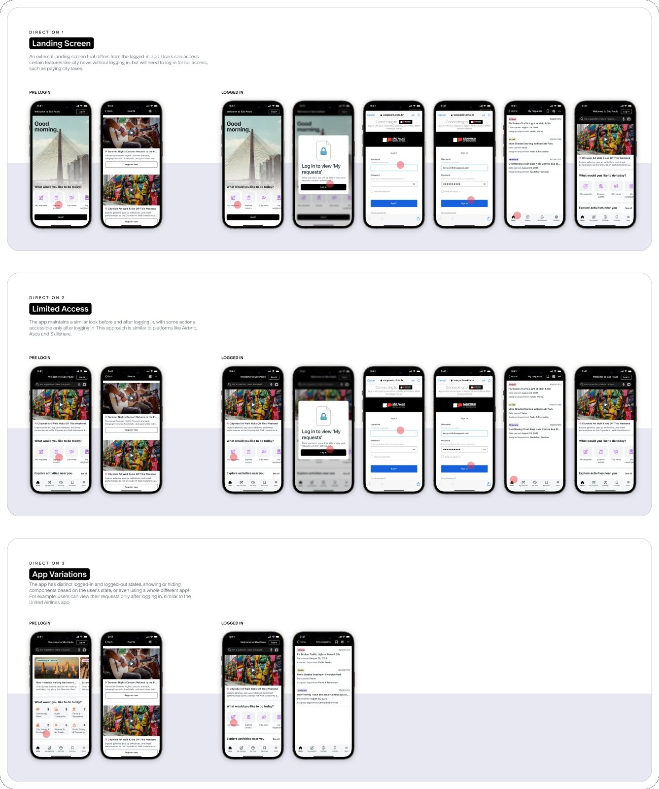
The direction that won — and that ultimately shipped — combined the strongest elements of Direction 1 and Direction 2. A pre-login state with real public-information utility, visually continuous enough with the logged-in app that the transition across authentication didn't feel like entering a different product, but with a clear logged-in step that unlocked the personal-account actions where authentication actually mattered. The deliberate decision the team made was that the first screen would not be a login screen.
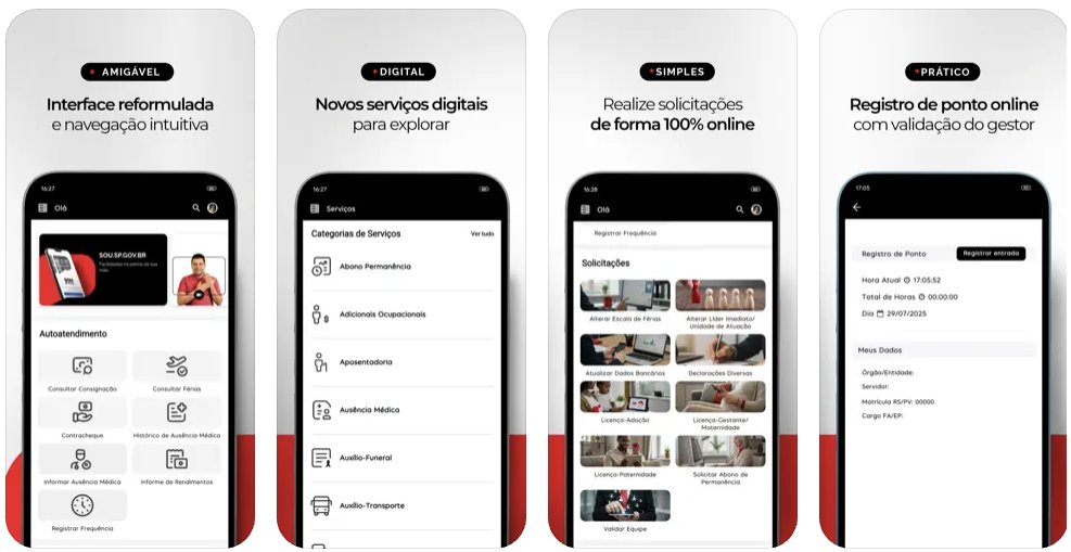
The customer's own four-word framing of the live app — Amigável · Digital · Simples · Prático (friendly, digital, simple, practical) — is the public articulation of that design decision. The app is friendly because it didn't gate-keep at the door. Practical because the actions it surfaced were the ones citizens and employees actually came for. The customer published that framing on the App Store marketing screenshots; it wasn't a phrase the design team supplied.
The launch had its share of cross-functional moments that needed the mobile team to operate beyond the surface of the app — including a publishing-flow gap that the team helped close in the final weeks before go-live, and that was subsequently formalized as platform capability for future public-sector accounts. The pattern across both the surface design work and the unblock work was the same: treat the first-time user's path as the design problem, regardless of whether the obstacle in front of that user was a screen, a platform constraint, or a publishing flow.
What shipped and what it produced
Population-scale adoption in days, not quarters.
- 95,000 mobile users in the first four days after go-live, on track to the 1.1 million state employee target population. Adoption velocity ran ahead of every comparable internal enterprise rollout on the mobile platform that quarter.
- 150,000 users within two weeks, sustaining the early curve rather than the more common adoption fall-off after launch novelty fades. The customer-facing services in the pre-login state did the work the team's design hypothesis predicted.
- #1–#2 in mobile usage across the platform that month, measured across launcher screens, mobile screens, and mobile hybrid content. The first major public-sector mobile account was outperforming the established enterprise accounts.
- First major public-sector mobile account at this scale on the ServiceNow platform, which made the launch a reference story for every public-sector and citizen-services opportunity that followed.
What it became.
São Paulo became the reference story across ServiceNow's Strategy, Planning, and Sales motions for mobile-first public-sector deployments. The pre-login design pattern the mobile team shipped informed subsequent platform work on logged-out vs logged-in app states. The account opened the path for Brazil's 26 other states and for broader public-sector and citizen-services expansion across the region.
Why this matters
The São Paulo launch confirmed something the platform had been assuming but not testing — that mobile, designed first rather than adapted from web, could carry adoption at population scale in a public-sector deployment, on the long tail of consumer Android hardware, with first-time users who had no warm onboarding context.
The decisive move was not flashy. The pre-login state was not a new design idea; consumer apps had used the pattern for years. What was new was applying it inside an enterprise mobile platform that had defaulted to login-first, against a population that needed a different default. The mobile team's work was in the discipline of seeing the problem clearly and shipping a solution that fit the customer and their users, rather than repackaging the platform's existing capabilities.
The principle is transferable. The experience before identification often determines whether the experience after identification ever gets seen. That applies to every consumer-grade mobile surface a platform tries to ship into a population-scale audience — and the São Paulo launch is the case study that proved it inside ServiceNow.